Oh boy, SUSPIRIA. A prime example of the “cheesy horror movies so well crafted that they can be considered art films” genre. I can’t even remember what first added it to my queue, but I do remember seeing references to it in a crazy 2010 playthough of the SNES game Clock Tower which led me to the following reasoning:
- Clock Tower is an insanely weird, horrific, and beautiful game.
- Clock Tower cribs scenes directly from Suspiria.
- Therefore, Suspiria must be even more weird, horrific, and beautiful than Clock Tower.
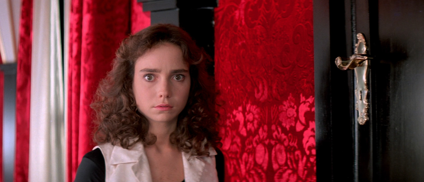
I finally sat around to watch Suspiria as part of Cinema Club. It starts off earnestly, showing the protagonist’s arrival at a creepy German ballet school in the middle of a thunderstorm. A visibly distressed girl runs out the door of the school and into the rainy night. This girl makes it to a friend’s apartment only to be violently murdered by some kind of ghost.
Suspiria has several make-your-skin-crawl scenes. We are shown a knife stabbing directly into a person’s beating heart. A girl falls into a room filled wall-to-wall with barbed wire and can’t stand up to reach the nearby door. A girl is pushed through a skylight and the falling debris impales her friend. Yet for each of these scenes, the rest of the movie is riddled with plot, acting, and technical flaws. Audio is especially bad. The cast spoke a mixture of English, Italian, and German so everything is dubbed via ADR and none of the dialogue quite matches up with the actors’ mouths.
I don’t want to tear Suspiria apart—I love a movie which wears its heart so proudly on its sleeve. I especially enjoyed the absolutely stunning cinematography. Suspiria is a Technicolor movie through and through. It’s got that unreal contrast-too-high quality, and every single color pops. It was apparently printed on the last Technicolor printer in Rome, two years after the last US plant was closed down.
The Technicolor process appears to have been abandoned for being slow and expensive, not because it was replaced by a higher quality alternative. Granted, modern films do all sorts of grading digitally, but to get the kinds of shots in Suspiria out of a slow analog process impresses me. Coming out so late in Technicolor’s history, I like to think of Suspiria as some kind of apex, the culmination of decades of work on analog color in cinema.
Several major scenes in the film take place at night, in darkness. Suspiria gives each scene a unique dramatic atmosphere by flooding the frame with filtered red, green, or blue light. It’s understood that the characters are in pitch darkness, but we see everything going on in an eerie otherworldly (and voyeuristic) way.
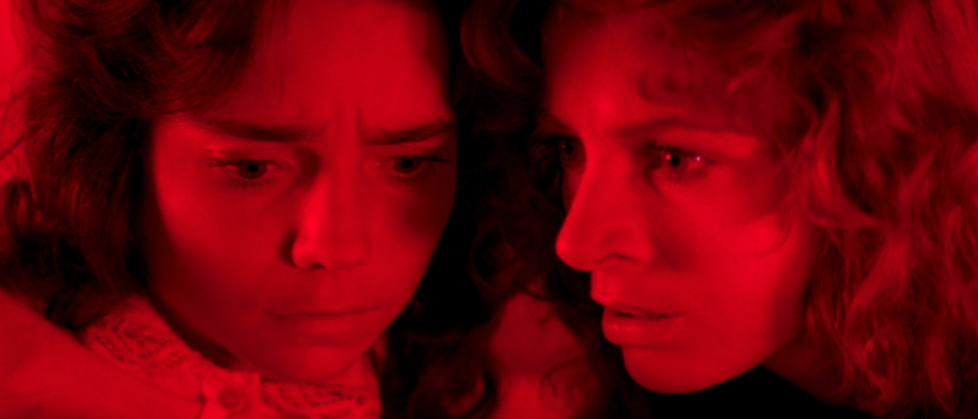
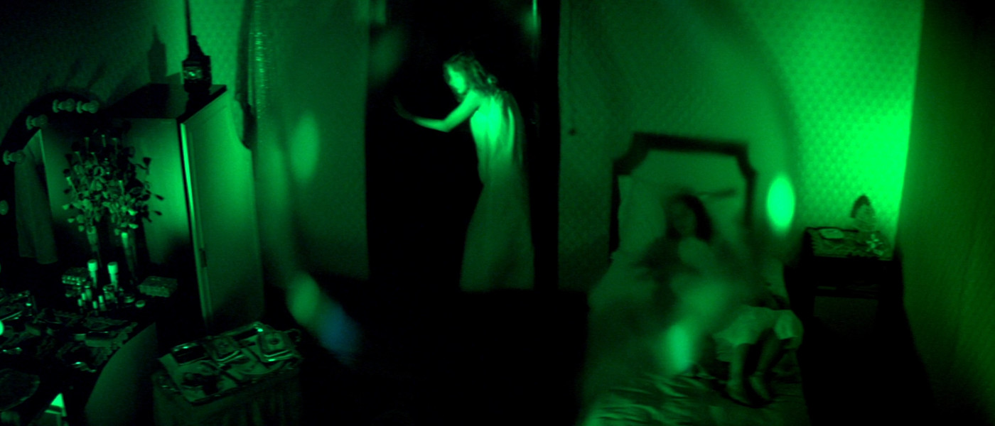
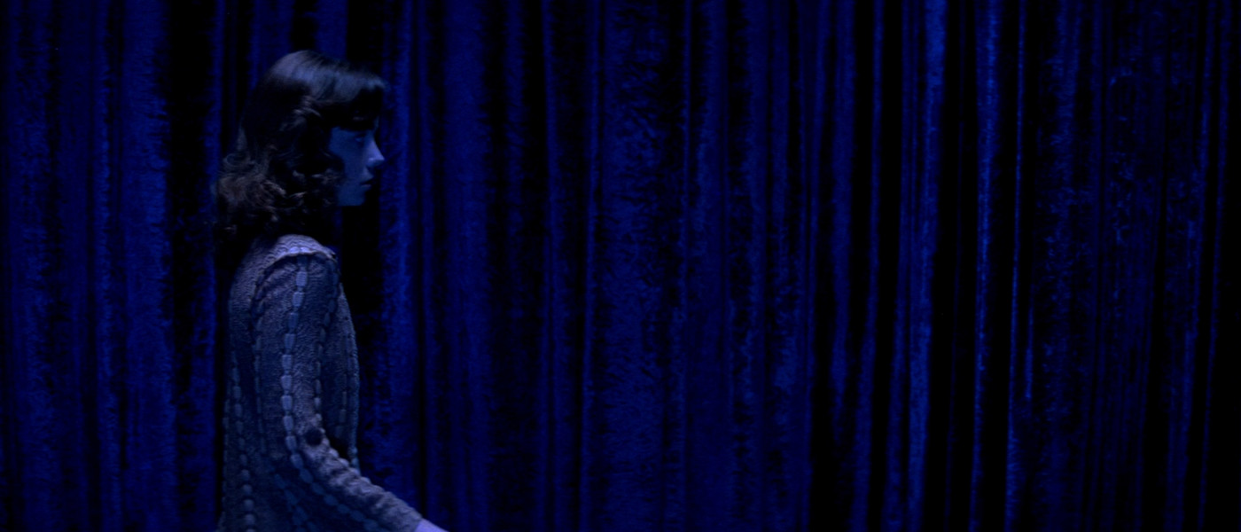
I’ve put palettes beneath the screenshots above to show how monochromatic these scenes are. They run exclusively black/red, black/green, and black/blue, which, maybe not coincidentally, are the colors used in the three-strip Technicolor process. I have to wonder if these parts of the film were maybe only shot with a single strip, in order to save money on film and processing costs (in addition to giving the striking look).
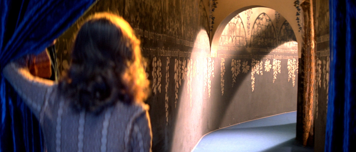
Which isn’t to say that lit scenes in Suspiria are any less striking. The sets and framing in the movie are meticulously designed. Look at the way the lighting breaks the symmetry of the staircase in the back of this hallway scene, or how the tan tones equally balance out the strong red highlights (with a perfect hit of turquoise up at the top).
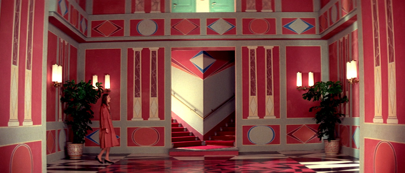
Red plays a very prominent role in the film and there’s no lack of it in most scenes. But it is also very balanced with black and tan tones. The intricate patterns on the walls of the school always stand out. Texture and depth everywhere.
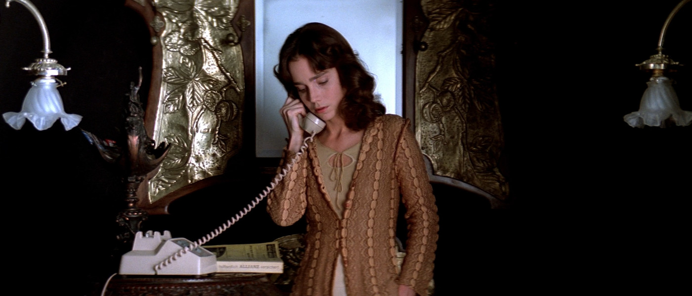
I love the attention to detail in the framing, light, and texturing of this scene. It looks like a Baroque painting (albeit with a clunky 70s phone).
And here’s a wonderfully balanced Blue / Orange scene. Opposite sides of the color wheel are used as complimentary colors and the number of tones on each side are roughly even.
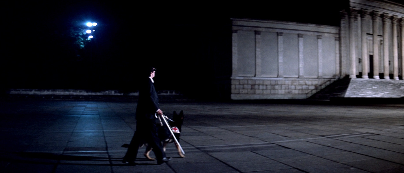
There’s a blind character in Suspiria who walks with a guide dog and a cane. I noticed his cane was white in earlier scenes which seemed unusual, but I figured it was just a cool Italian fashion.
Later on, there’s an important scene featuring this character, set in a dark plaza. The choice of white cane seems intended for this scene, as it highlights his handicap, along with the white service band his dog wears. The red cross on the band stands out like a splash of blood, the only non-blue tone in an otherwise muted scene.
So I liked Suspiria, it was fun to look at for a few hours. It was also fun to analyze, once I started noticing all the work put into the colors of the film.
A while ago I took a class where we used k-means clustering to identify color palettes for compressing image data. I wanted to do the same for the Suspiria screenshots, so I wrote up a quick and dirty JavaScript implementation. It generated the color palettes below each image in this post.
K-means is an approach to classifying data. You pick a value of k (in this case it’s ) and choose that many “centroids” at random out of your data points. For each remaining data point, you pick the centroid closest to the point and assign it to that centroid’s cluster. When all the points have been assigned, you move the centroids to the average of every point in its cluster, and then clear the clusters and repeat the process until the centroids stop moving.
In this case, the data points are individual pixel colors, and k is the size of the palette. There’s a random component in my implementation, and k-means doesn’t always find the best grouping (or sometimes takes very long to converge) so changing the random number seed results in different output. It was fun to see how changing these values affected the palettes, so I left in the sliders below. Every time you change the values a new palette is added below each image, so you can see how the changes affect things from iteration to iteration. As an example of things which can change, the red cross in the last image usually gets clustered into its own shade, but sometimes falls into another non-red cluster and is averaged out (this is more likely to happen if k is small).
Bet you didn’t think you’d be learning about data mining techniques in an article about a 70s horror film!
Comments? If you have feedback, please share it with me on Twitter!